
Design Role
UX Research
UI Design
Visual Design
Deliverables
Competitive Analysis
User Interviews
Affinity Map
Persona
User Journey
Wireframes
User Testing
Prototype
Tools
Figma
Maze
Invision
Background
The project focuses on the redesign of the Travel Unity website, a 501c non-profit organization dedicated to promoting diversity in travel. The project aims to improve the user experience and achieve specific objectives outlined by the organization.
Overview
Problems
-
Lack of Call-to-Action Buttons: Users are not sufficiently guided or prompted to take desired actions on the website, leading to low engagement and conversion rates.
-
Difficulties in Navigating the Menu: The website's menu structure is complex and challenging to navigate, making it difficult for users to find desired information quickly.
-
Low Viewer Engagement: Users are not actively engaging with the website's content, resulting in decreased interest and limited interaction with the organization's offerings.
-
Information Overload and Prioritization: Travel Unity offers an extensive range of services, events, and consulting, creating challenges in presenting and organizing the information effectively, leading to confusion for users.
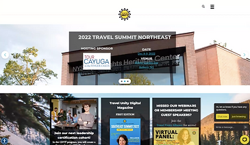

Images of Travel Unity website before redesign.
Insights - Google Analytics
Homepage
Page views
37,368
Bounce rate
71.98%
Avg time on page
00:01:52
Youth/Collegiate Page
421
41.57%
00:01:41
College Corps Page
212
48.11%
00:04:10
Solutions
-
Improve findability:
-
Tailor information, enhance search, and use clear categorization.
-
-
Highlight Youth & Collegiate programs:
-
Showcase prominently with visuals and compelling descriptions.
-
-
Enhance clarity and organization:
-
Simplify layout, use visual hierarchy and relevant imagery.
-

Process
Competitive Analysis
I conducted a competitive analysis which played a crucial role. By evaluating competitors' websites, applications, and overall user experiences, our team gained valuable insights into industry best practices, identified gaps and opportunities, and developed a deeper understanding of user expectations. This analysis served as a foundation for our design decisions, enabling us to create a unique and competitive user experience that stands out in the market.
Key Takeaways
-
Clear text hierarchy
-
Non-profit websites effectively highlighted their mission in the hero section, using text hierarchy to emphasize important information concisely.
-
-
Simplified and consistent navigation
-
One-click access to the home page and important pages reduced the need for users to think or search for information, improving the overall user experience.
-
-
Emphasize donate button
-
Placing the donate button prominently as the primary call to action made it easier and more efficient for users to get involved and donate to the cause.
-
User Interviews
I actively participated in conducting user interviews to gain valuable insights into user pain points related to the home page and youth and collegiate pages. As a team, we synthesized the data from the interviews, and we were able to understand the challenges and frustrations that users faced, allowing us to address their needs effectively in the design process. By incorporating user feedback, we created a more user-centered and impactful user experience for the target audience.

Key Takeaways
Lack of Motivation
6/6 users expressed their lack of motivation to view the website because of design (i.e. colors) and layout not being appealing.
Navigation
6/6 users were unsuccessful at navigating through pages due to navigation not matching their expectations.
Information Overload
5/6 users found the youth pages to be overwhelming with information.
Content Presentation
5/6 users had difficulty finding and understanding page content due to presentation.
Accessibility
4/6 users struggled to access information because of failed accessibility standards.
Persona
Together as a team, we created a user persona by studying our target audience. We gathered insights from research and interviews to understand their needs, goals, and behaviors. This persona guided us in making informed design decisions and creating an experience that truly connects with our users.
.png)
User Journey
As a team, we created a user persona by studying our target audience. We gathered insights from research and interviews to understand their needs, goals, and behaviors. This persona guided us in making informed design decisions and creating an experience that truly connects with our users.

Problem Statement
How might we enhance content and information structure on home and youth pages to reduce bounce rates and boost the visibility of youth and collegiate programs?
Ideation
Initial Sketches
After organizing our research and pinpointing the core problem, we dove into brainstorming design solutions for key website pages: the homepage, the youth & collegiate page, and the program page. Each team member sketched their ideas independently, allowing for a range of creative perspectives. When we came together, we shared and discussed our concepts, thoughtfully deciding which features and designs best aligned with our goals. This collaborative process shaped the foundation for our final website solution.


%20(4).jpg)
%20(5).jpg)
Wireframing
With our solution's key functionalities defined, we brought our ideas to life by creating low-fidelity wireframes in Figma. To map out the flow and functionality of each page, we added note cards directly to the wireframes. This step helped us visualize the user journey and refine the structure of our design.
We then translated our wireframes into high fidelity screens. Using these wireframes, we conducted usability testing with 23 participants. This allowed us to gather feedback to help guide us make improvements before moving into the next iteration of our design.

Feedback
-
Use basic site navigation/breadcrumb to guide users and help them understand where they are.
-
Assuming the Travel Unity logo is clickable and leads to home, we can reduce clutter in our nav menu by removing 'Home'.
-
Add spacing between the alliance login and the background headers.
-
Keep a consistent look for primary buttons.

Final Prototype
Ways We Added Value
-
Simplified and condensed the navigation, which increased the discoverability rate by 25% for student programs.
-
Made page content digestible and added information architecture, leading to a 100% success rate in users signing up for a student program.
-
Decreased the bounce rate on the home page from 75.89% to 16.7%.
Future Iterations
In future iterations, I plan to improve the user flow to make alliance memberships more discoverable and accessible. Since memberships are the organization's primary source of revenue, these changes would help attract more users, increase memberships, and ultimately drive greater revenue for Travel Unity.